Frontend components
The integration ships with an out-of-the-box set of frontend components styled with Tailwind CSS and aligned with the content model in your CMS. Once you copy them into your project with our CLI, you can adjust their code further to suit your needs.
We have divided them into three categories: page components, layout components and wrappers.
We strongly advise you to delve into the Storefront UI documentation to learn more about customizing Vue and React components so that they can best match your project design.
Page components
The main building blocks of your dynamic CMS pages. They are based (mostly) on Blocks and Base Components provided by our Storefront UI library.
Accordion
Accordion allows you to display collapsible and expandable sections of content. It consists of a vertical stack of panels or sections, where each section has a header and associated content. The headers serve as clickable elements that allow the user to expand or collapse the associated content.
Under the hood, it uses the Accordion Item Base Component. Refer to the Storefront UI documentation for an interactive live preview with code examples and accessibility notes.
Banner
Banner features an attention-grabbing image, configurable background color and text fields allowing you to deliver important messages to the users. It also has a call-to-action button inviting users to visit specific pages (e.g. a product page or a promo page).
It is derived from the Banners Block. Refer to the Storefront UI documentation for an interactive live preview with code examples and accessibility notes.

Card
Card component is ideal for displaying concise information or a summary of a larger content piece. It features an image, a title, a description and a call-to-action button.
Is is derived from the Card Block. Refer to the Storefront UI documentation for an interactive live preview with code examples and accessibility notes.

Category Card
Category Card component is a graphic representation of product categories available in your store. It can be placed within the flow of the page, outside of the header navigation. It is clickable and features an image as well as a title.
Is is derived from the Category Card Block. Refer to the Storefront UI documentation for an interactive live preview with code examples and accessibility notes.

Editorial
Rich Text editors available in Content Management Systems allow editors to create text content with extended formatting capabilities (i.e. applying styles such as bold, italics, headings, bullet points, hyperlinks, and more).
The Editorial component takes the raw HTML generated by the editor and renders it on a page. It also applies project-specific CSS classes to customize the look & feel of elements such as headings, paragraphs, tables and links. It uses a lightweight cheerio library to perform HTML manipulations - both server-side and client-side.
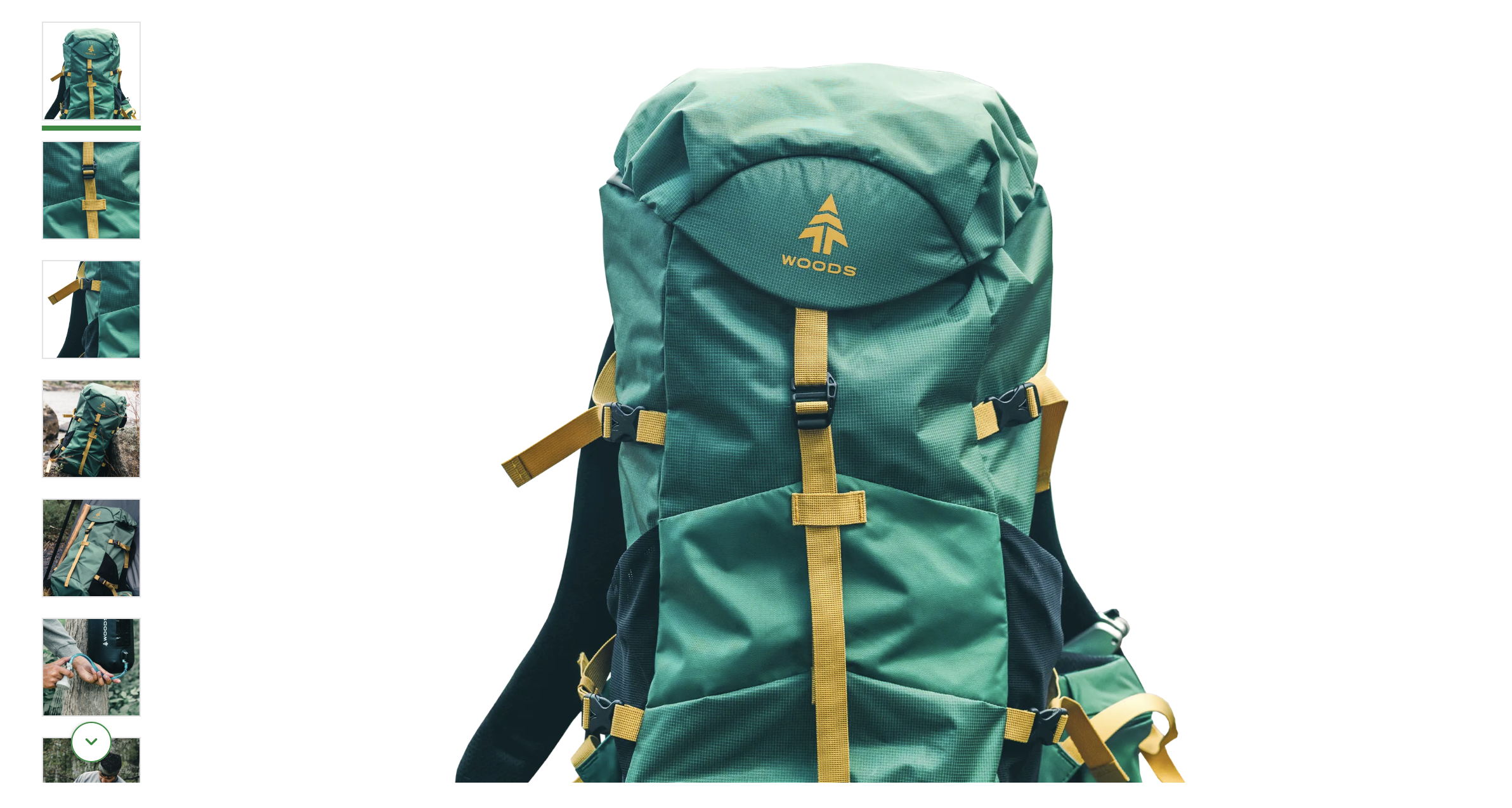
Gallery
Gallery allows you to display a collection of images with a single large image and a row of scrollable and clickable thumbnails. It is primarily intended for use on product pages, where it serves as an effective tool for showcasing product images.
Is is derived from the Gallery Block. Refer to the Storefront UI documentation for an interactive live preview with code examples and accessibility notes.
Grid
Grid is a powerful component which takes in other page components (e.g. Banner) and displays them in a structured grid layout. It operates on the CSS grid-template-areas property, giving content editors a descriptive syntax for achieving their desired configurations of rows and columns.
Every grid item is assigned a letter from the alphabet which can be used to define its placement in the grid.
Single row
Three items in a single-row, three-column layout.
"a b c"

2x2
Four grid items in a classic 2x2 grid.
"a b"
"c d"

2x1
Three items where the first one has been moved to the bottom of the grid and spans the entire row.
"b c"
"a a"

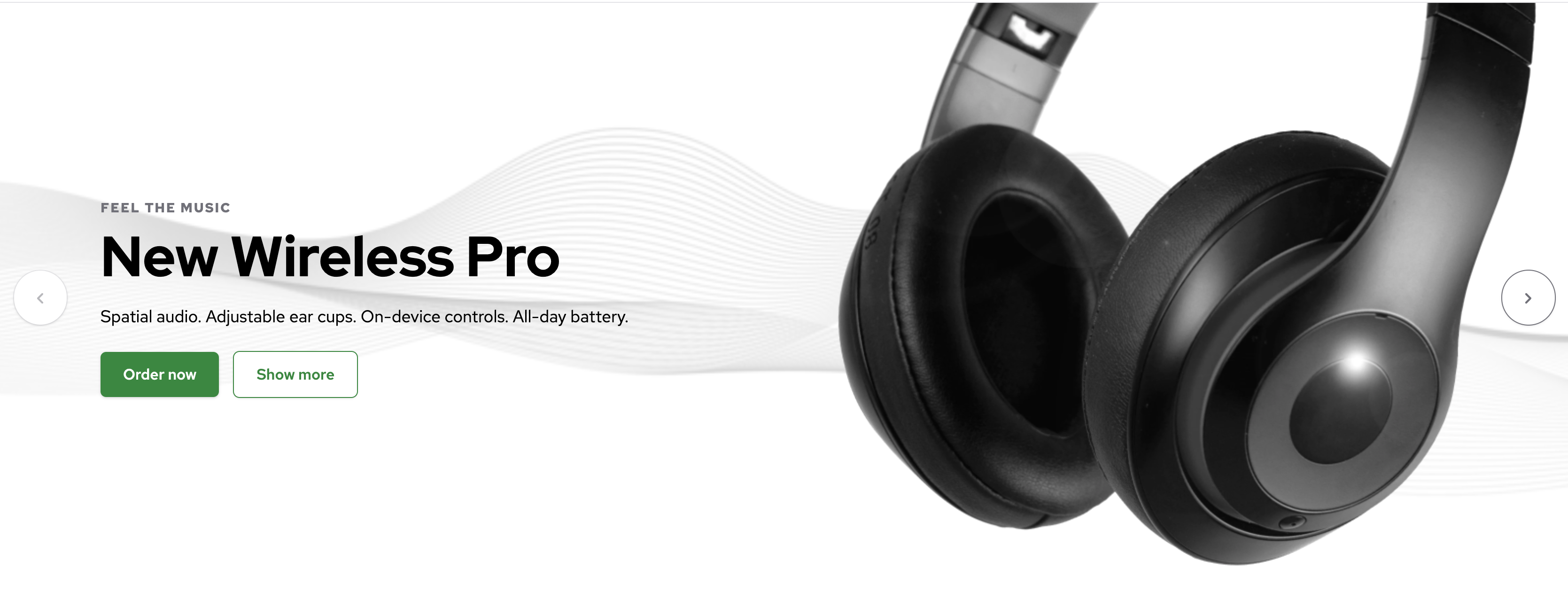
Hero
Hero is very similar to the Banner component but it is meant to be used on top of the page to create an impactful first impression. It features a background image or color, an image, various text fields and call-to-action buttons.
Is is derived from the Hero Block. Refer to the Storefront UI documentation for an interactive live preview with code examples and accessibility notes.

NewsletterBox
Newsletter Box engages users and allows them to subscribe to the Newsletter offered by the website owner. It features an email input field and customizable background, button text and heading and description. It is usually placed near the bottom of the page. The logic behind sending the inputted email address to the database has to be defined on the frontend component level - CMS is capable of customizing the visual layer only.
Is is derived from the NewsletterBox Block. Refer to the Storefront UI documentation for an interactive live preview with code examples and accessibility notes.

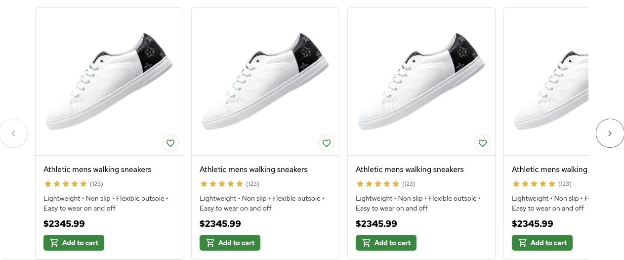
Product Card
Product Card allows you to display a condensed set of Product information. It features an image, a title, a description, an image, a rating representation and a price. In combination with the Grid component, can be used to build product listings. In combination with the Scrollable component, can be used to build a slider presenting related products on a Product Details Page.
Is is derived from the ProductCard Block. Refer to the Storefront UI documentation for an interactive live preview with code examples and accessibility notes.
Scrollable
Scrollable takes in other page components (e.g. ProductCard and Hero) and displays them as an interactive slider. Useful as the main building block for product carousels and hero sliders.
Is is derived from the Scrollable Base Component. Refer to the Storefront UI documentation for an interactive live preview with code examples and accessibility notes.
Layout components
Just like page components, they are based on the Storefront UI library. However, they are meant to be used in layouts instead of pages. They include components such as Footer and MegaMenu which we want to be rendered once (during the initial page load) and persisted across all pages.
MegaMenu
MegaMenu allows you to easily build your application header. It features customizable logo and navigation tree with two levels of nesting. It is derived from the MegaMenu Block. Refer to the Storefront UI documentation for an interactive live preview with code examples and accessibility notes.

Footer
A standard footer component meant to be placed at the very bottom of the page. It features a customizable navigation tree with a single level of nesting. It is derived from the Footer Block. Refer to the Storefront UI documentation for an interactive live preview with code examples and accessibility notes.

Wrappers
Wrappers are responsible for rendering page and layout components based on the raw data coming from the CMS.
BRXComponent
An entrypoint component registered as TYPE_CONTAINER_ITEM_UNDEFINED. It acts as a wildcard component rendered once for every managed component (e.g. Banner, Grid) or menu added through the Experience Manager. It is responsible for:
- extracting Bloomreach
componentdocument from thepageobject and recursively resolving its properties (e.g. references and image sets), - extracting Bloomreach
componentparameters, - building component properties from the extracted
componentdocument and parameters, - passing the properties on to RenderComponent for further processing and rendering.
The component also renders the br-manage-content-button which allows you to edit components and menus within the Experience Manager.
RenderComponent
The main wrapper component directly responsible for rendering page and layout components. It receives the agnostic cms component object as the item prop and renders (eagerly or lazily) the corresponding frontend component. It also applies dynamic CSS styles to the component based on the styles property coming from the CMS as part of the item prop.