Creating components
This guide will show you how you could approach adding new components to your Alokai & Bloomreach Content setup. The described steps will also come in handy while editing the existing components.
Before following this guide, make sure you've followed the bootstrapping guides from the Getting started section.
Creating a frontend component
In this part, you're going to create a very basic frontend component with three dynamic props, displaying two lines of text and a button. Second, you're going to import it in the RenderComponent wrapper which will use it to render entries of the corresponding content type.
Nuxt 3
In the /components/cms/page directory, create a new Example.vue file with the following content:
<template>
  <h1>{{ title }}</h1>
  <h2>{{ subtitle }}</h2>
  <button v-if="button">{{ button.label }}</button>
</template>

<script lang="ts" setup>
import type { AgnosticCmsButton } from '@vsf-enterprise/cms-components-utils';

defineProps<{
  title?: string;
  subtitle?: string;
  button?: AgnosticCmsButton;
}>();
</script>
Once done, import the newly created component in the /components/cms/wrappers/RenderComponent.vue wrapper. We recommend adhering to the original pattern and defining it as an Async Component:
<script lang="ts" setup>
// ...
const components = {
  // ...
  Example: defineAsyncComponent(() => import('~/components/cms/layout/Example.vue')),
};
</script>
Next 13
In the /src/components/cms/page directory, create a new Example.tsx file with the following content:
import type { AgnosticCmsButton } from '@vsf-enterprise/cms-components-utils';

type ExampleProps = {
  title?: string;
  subtitle?: string;
  button?: AgnosticCmsButton;
};

export default function Example({ title, subtitle, button }: ExampleProps) {
  return (
    <>
      <h1>{ title }</h1>
      <h2>{ subtitle }</h2>
      { button &&
        <button v-if="button">
          { button.label }
        </button>
      }
    </>
  );
}
Once done, import the newly created component in the /src/components/cms/wrappers/RenderComponent.tsx wrapper:
import Example from '../page/Example';

const components = {
  // ...
  Example
};
Creating CMS component
In this section, we are going to create a content-driven component in Bloomreach. The process involves the following steps:
- creating a content type,
- creating a folder for documents,
- creating the actual component.
Read more
We strongly recommend you supplement following this guide by reading the official Bloomreach tutorials on content modeling.
Good to know
If you are looking for a faster and more efficient way to create Bloomreach Content artifacts, we highly recommend using our Bloomreach Content Manager tool.
Creating a content type
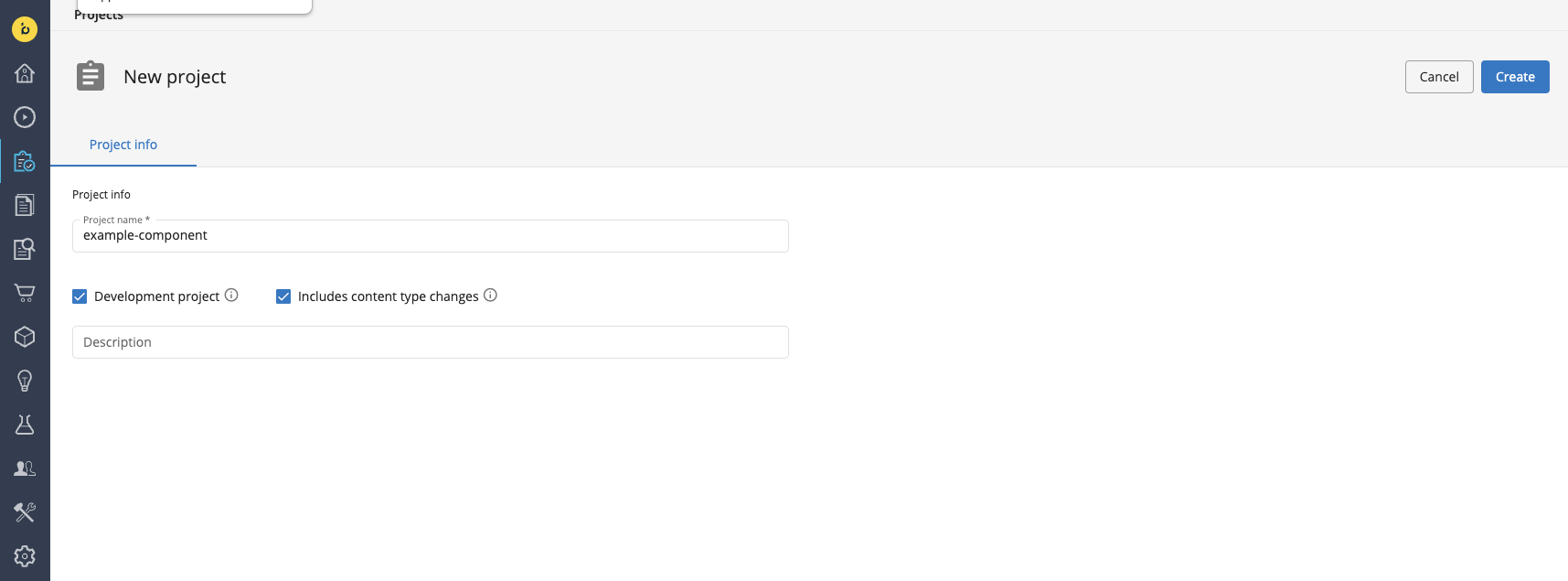
To create a content type in Bloomreach, you have to create a development project with content type changes first. Using the left-hand-side menu, navigate to the Projects tab and click the blue + Project button. Give your project some arbitrary name, tick the Development project and Includes content type changes boxes and click the Create button.
Once the development project has been created, use the left-hand-side menu to navigate to the Content Application. From the dropdown in the top-left corner, select Content types and open the Vue Storefront (vuestorefront) folder. You will see all of the default content types provided by Alokai as part of the integration.
Hover over the folder name, click the three dots and select the New document type option.
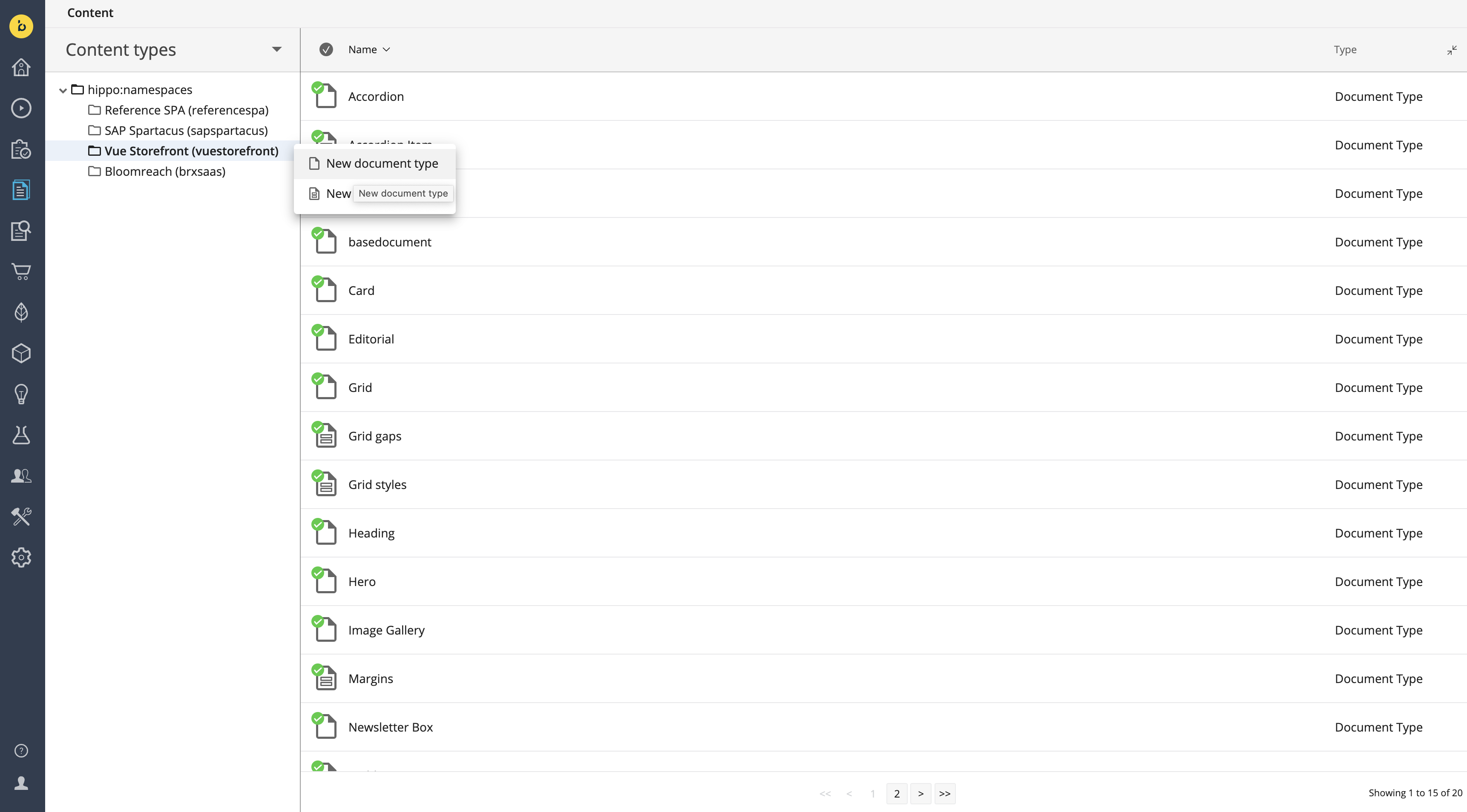
In the dialog box that appears, name your new content type Example and select the one-column layout. Click OK to confirm.

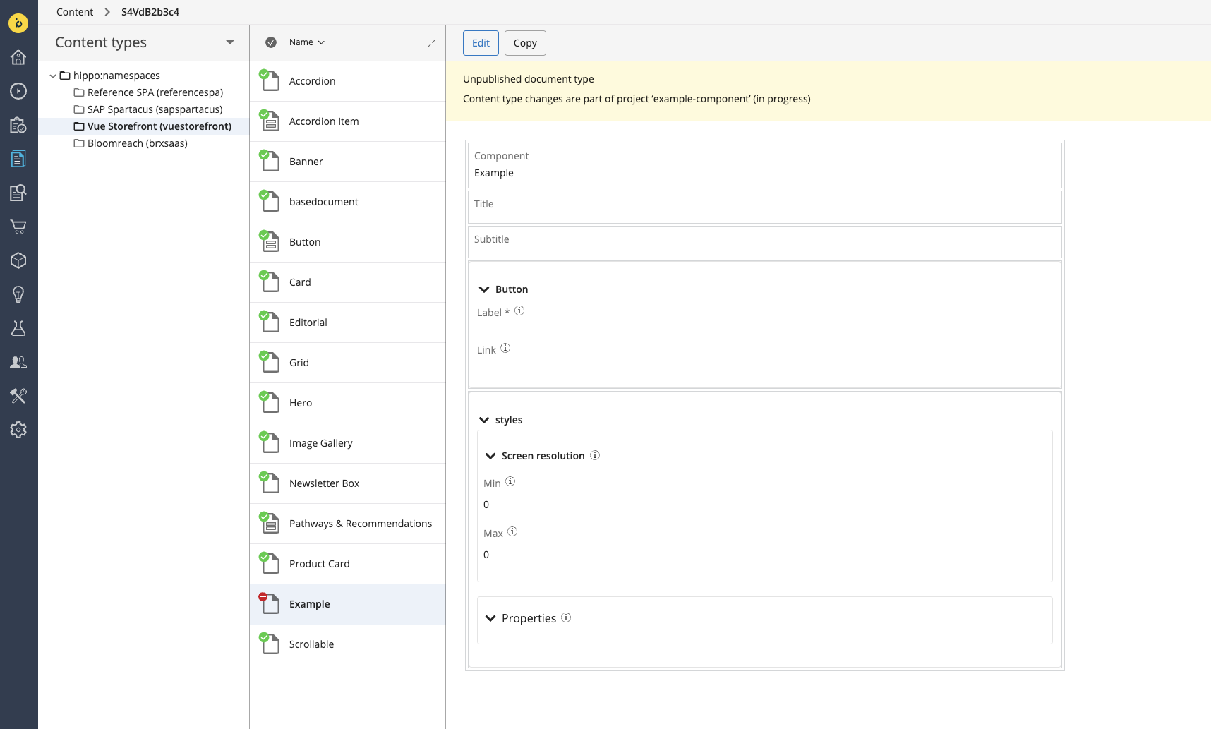
In the content type editor, start with creating a component string field with "Example" as the default value.
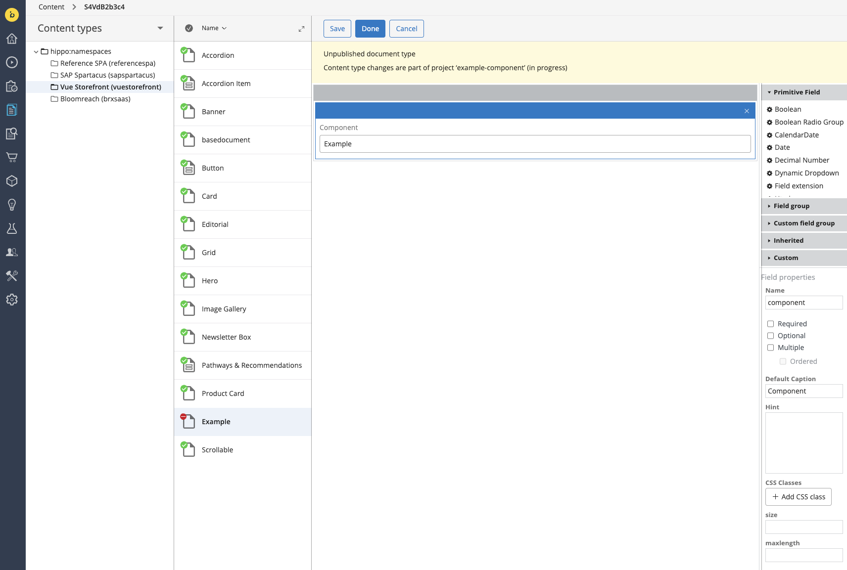
Next, you can add fields whose values will be passed as dynamic props to your frontend component. Start with adding two simple text fields: title and subtitle. The procedure is the same as with the component field except you don't set any default value.
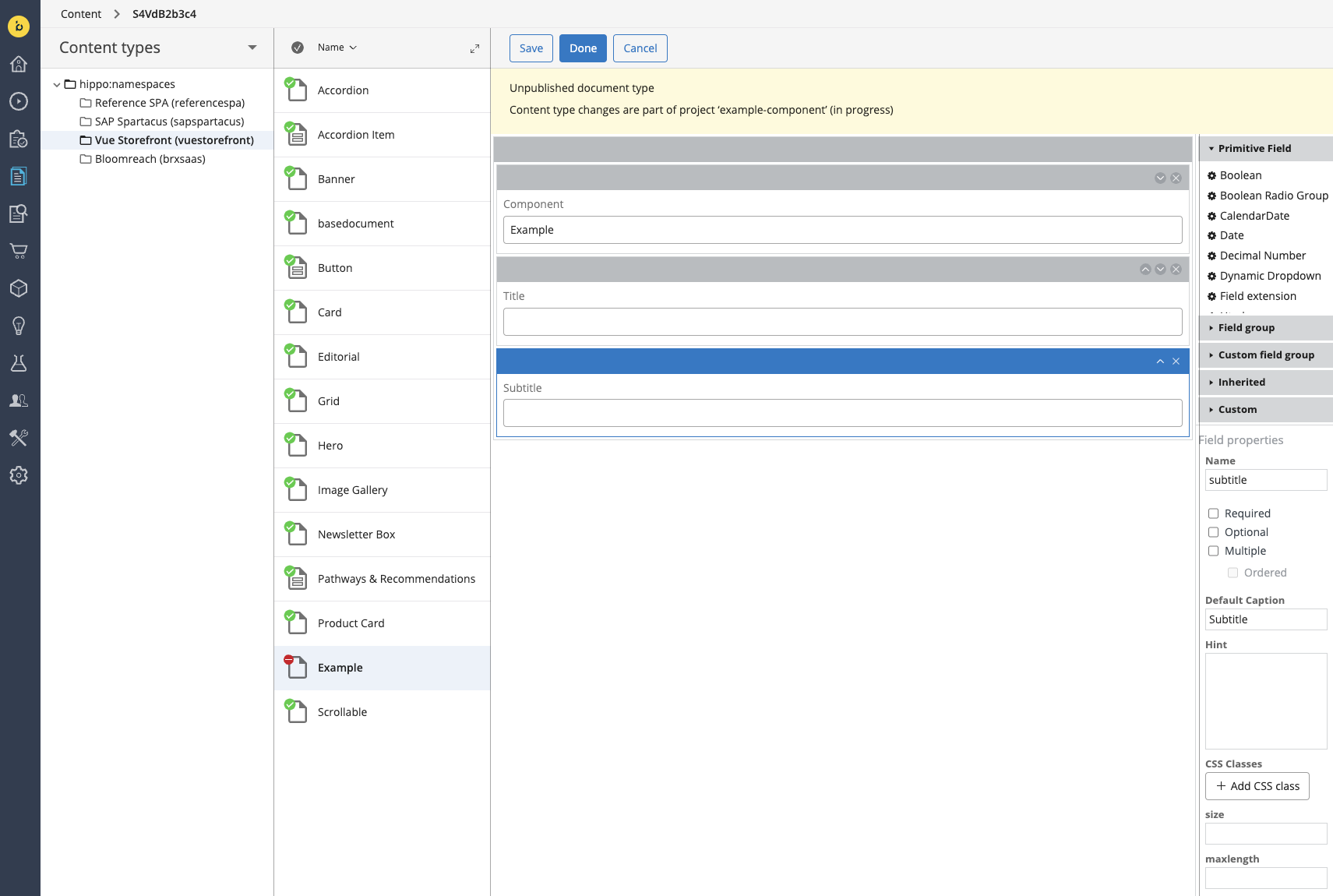
Last, create the button field by choosing the field group with the same name from the Custom field group menu on the right. As a bonus, you can make your component stylizable by adding the Styles custom field group to it, naming it styles and marking it as Multiple. Once done, save your Example content type schema by clicking the blue Done button. Now it should look like this:
Creating a folder for documents
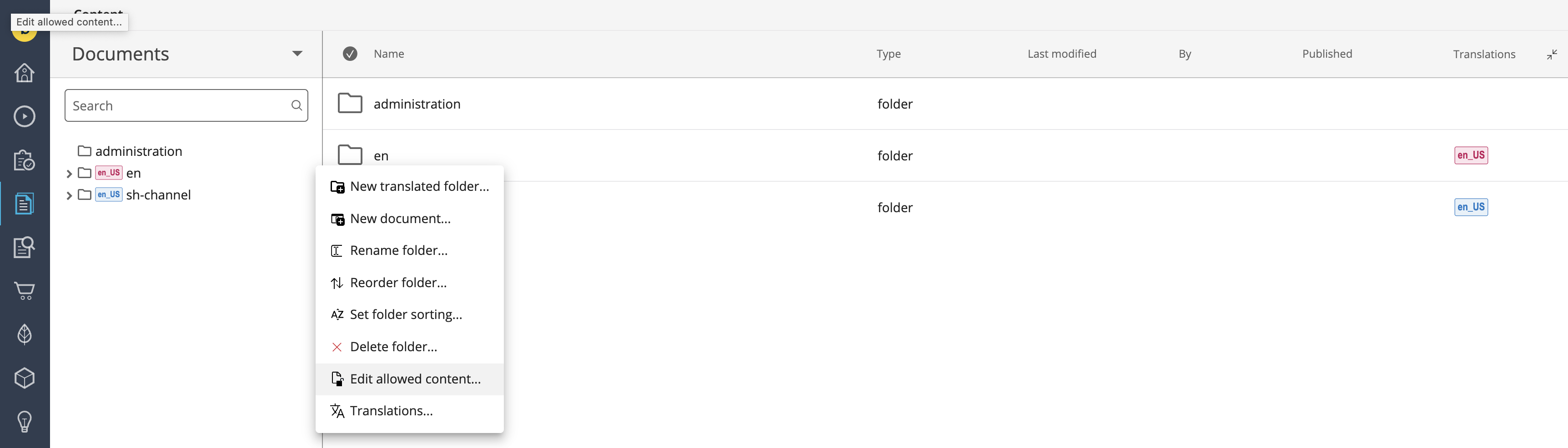
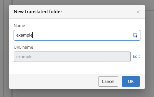
With the content type in place, let's create a folder for storing our documents. Staying within the Content Application, select Documents from the dropdown in the top-left corner. Hover over the name of your channel's folder, click the three dots and select the New translated folder... option.
Give your folder the name example and click OK.
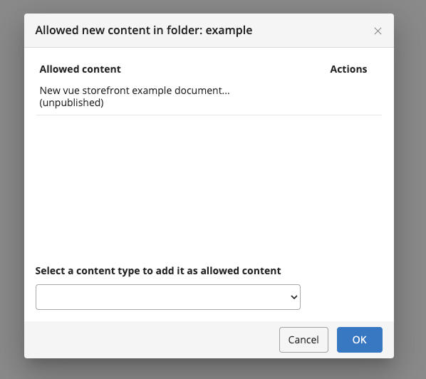
Once your new folder appears on the list, hover over it, click the three dots and select Edit allowed content.... In the Select a content type to add it as allowed content dropdown, find the name of the newly-created content type and pick it. Click OK to save.
With the content type and folder in place, go back to the Projects tab. Select your active project, click the + Channel button on the right and select the desired channel from the list. We've added the example folder to the en channel directory so we are going to choose that one. Once done, click the blue Add button.
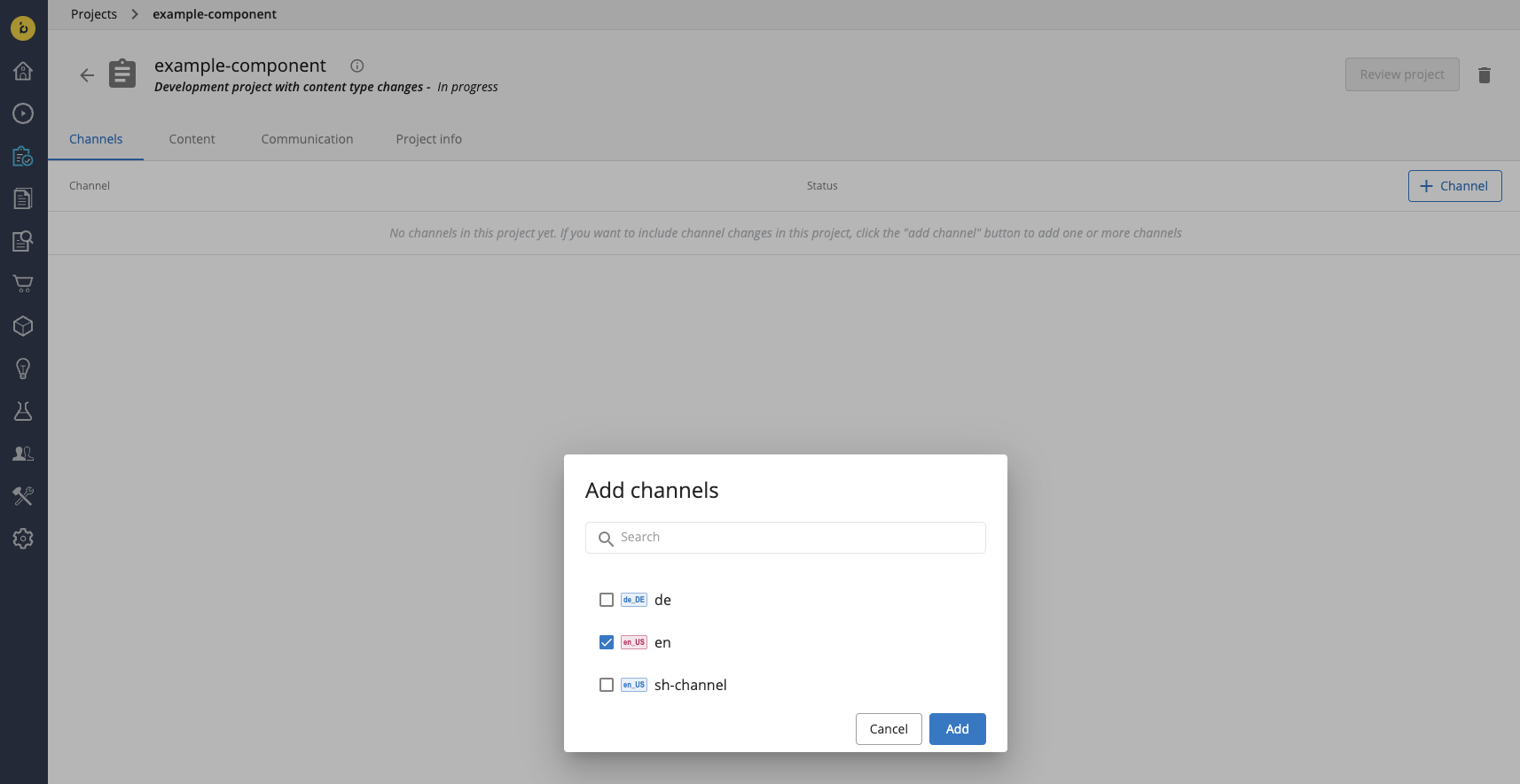
After adding the channel to the project, click the blue Review project button in the top-right corner. On the channel list, accept the changes by clicking the tick ✔️ symbol on the right. Confirm by clicking the blue Merge button which should appear in the top-right corner.
If the Merge button does not appear, it probably means you need more than 1 acceptance to merge your project.
Creating a component
To create the actual component, you must once again create a new project but - this time - without content type changes. Once the project is created, add the desired channel to it - just like you did at the end of the previous section.
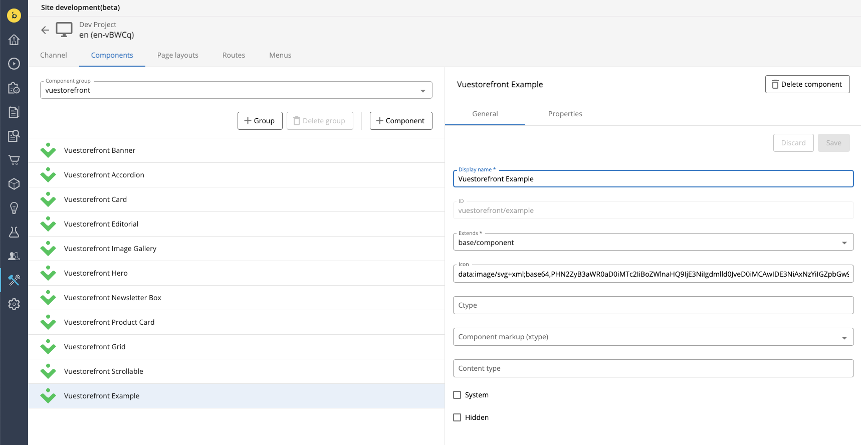
As a next step, navigate to the Site Development App and select your project from the list. Go to the Components tab and select the vuestorefront component group from the dropdown below. Then click the + Component button and fill the form with the properties listed below.
| Property | Value |
|---|---|
| Display name | Vuestorefront Example |
| ID | vuestorefront/example |
| Extends | base/component |
You can also add a path to the Vuestorefront logo in the Icon field:
data:image/svg+xml;base64,PHN2ZyB3aWR0aD0iMTc2IiBoZWlnaHQ9IjE3NiIgdmlld0JveD0iMCAwIDE3NiAxNzYiIGZpbGw9Im5vbmUiIHhtbG5zPSJodHRwOi8vd3d3LnczLm9yZy8yMDAwL3N2ZyI+CjxwYXRoIGQ9Ik03OS4yMTY1IDUuOTI0MDFDNzcuNjQ2MiA2LjkwMDUzIDc2LjEwNTIgOC40NDE0NyA3My4wMjM0IDExLjUyMzRDNjkuOTQxOCAxNC42MDQ4IDY4LjQwMDQgMTYuMTQ2MyA2Ny40MjQgMTcuNzE2NUM2NC4xOTIgMjIuOTE0IDY0LjE5MiAyOS40OTYgNjcuNDI0IDM0LjY5MzVDNjguNDAwMyAzNi4yNjM1IDY5Ljk0MDkgMzcuODA0MSA3My4wMjE1IDQwLjg4NDhMNzMuMDIzIDQwLjg4NjRDNzYuMTA0OSA0My45NjgyIDc3LjY0NjIgNDUuNTA5NSA3OS4yMTY1IDQ2LjQ4NkM4NC40MTQgNDkuNzE4IDkwLjk5NiA0OS43MTggOTYuMTkzNSA0Ni40ODZDOTcuNzYzOCA0NS41MDk1IDk5LjMwNDggNDMuOTY4NSAxMDIuMzg3IDQwLjg4NjdDMTA1LjQ2OSAzNy44MDQ4IDEwNy4wMDkgMzYuMjYzOCAxMDcuOTg2IDM0LjY5MzVDMTExLjIxOCAyOS40OTYgMTExLjIxOCAyMi45MTQgMTA3Ljk4NiAxNy43MTY1QzEwNy4wMDkgMTYuMTQ2MiAxMDUuNDY5IDE0LjYwNTMgMTAyLjM4NyAxMS41MjM0Qzk5LjMwNDggOC40NDE1NCA5Ny43NjM4IDYuOTAwNTMgOTYuMTkzNSA1LjkyNDAxQzkwLjk5NiAyLjY5MjAyIDg0LjQxNCAyLjY5MTk4IDc5LjIxNjUgNS45MjQwMVoiIGZpbGw9IiMwMkM2NTIiLz4KPHBhdGggZD0iTTk5LjQ5MjggMTAyLjM0MUwxMzUuMzUzIDY2LjQ4MDRDMTM2LjgzOSA2NC45OTQ2IDEzOC42MDMgNjMuODE2MSAxNDAuNTQ0IDYzLjAxMkMxNDIuNDg1IDYyLjIwNzkgMTQ0LjU2NiA2MS43OTQxIDE0Ni42NjcgNjEuNzk0MUMxNDguNzY4IDYxLjc5NDEgMTUwLjg0OCA2Mi4yMDc5IDE1Mi43OSA2My4wMTJDMTU0LjczMSA2My44MTYxIDE1Ni40OTUgNjQuOTk0NiAxNTcuOTggNjYuNDgwM0wxNzYgODQuNDk5OEMxNzUuODkxIDg0LjYwOCA4OCAxNzIuNSA4OCAxNzIuNUwwIDg0LjQ5OTlDMC4yMzg3NDUgODQuMjYxOCA5Ljk4MTYgNzQuNTE4OCAxOC4yMDkyIDY2LjI5MUMxOS42OTQxIDY0LjgwNTkgMjEuNDU3MSA2My42Mjc5IDIzLjM5NzMgNjIuODI0MkMyNS4zMzc2IDYyLjAyMDUgMjcuNDE3MiA2MS42MDcgMjkuNTE3MyA2MS42MDcxQzMxLjYxNzQgNjEuNjA3MyAzMy42OTY5IDYyLjAyMTIgMzUuNjM3MSA2Mi44MjUyQzM3LjU3NzIgNjMuNjI5MiAzOS4zMzk5IDY0LjgwNzUgNDAuODI0NiA2Ni4yOTI4TDc2Ljg3NDMgMTAyLjM0MkM3OC4zNTk1IDEwMy44MjcgODAuMTIyNyAxMDUuMDA1IDgyLjA2MzIgMTA1LjgwOUM4NC4wMDM3IDEwNi42MTMgODYuMDgzNSAxMDcuMDI2IDg4LjE4MzggMTA3LjAyNkM5MC4yODQyIDEwNy4wMjYgOTIuMzYzOSAxMDYuNjEyIDk0LjMwNDMgMTA1LjgwOEM5Ni4yNDQ3IDEwNS4wMDQgOTguMDA3NyAxMDMuODI2IDk5LjQ5MjggMTAyLjM0MVoiIGZpbGw9IiMwMkM2NTIiLz4KPC9zdmc+Cg==
Once done, click the blue Create button and the Vuestorefront Example component will appear on the list.
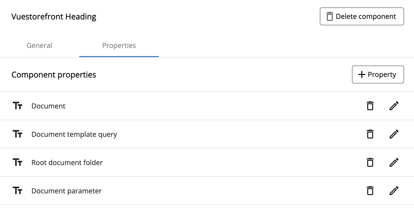
Next, navigate to the Properties tab in the newly created component. Click the + Property button and select New content path property. Fill out the form with the properties listed below. Once done, click the Save button.
| Property | Value |
|---|---|
| name | document |
| label | Document |
| value type | string |
| picker configuration | cms-pickers/documents-only |
| selectable node types | vuestorefront:Example |
After that, create 3 more simple properties with the following configurations:
| Property | Value |
|---|---|
| name | document-template-query |
| displayName | Document template query |
| value type | string |
| default value | new-vuestorefront-Example-document |
| hidden | true |
| Property | Value |
|---|---|
| name | root |
| displayName | Root document folder |
| value type | string |
| default value | example |
| hidden | true |
| Property | Value |
|---|---|
| name | parameter |
| displayName | Document parameter |
| value type | string |
| default value | document |
| hidden | true |
After you save all of them, the properties of your Vuestorefront Heading component should look like this:
Now you can go back to the Projects tab and merge your project. Congratulations! You've just created your first component.
What next?
Your frontend component and the corresponding Bloomreach Content content type, folder and component are ready. Not it's time you added it to some page that can be rendered by your frontend application. Follow the guide on creating pages to see how it's done.