Creating components
This guide will show you how you could approach adding new components to your Alokai & Contentful setup. The described steps will also come in handy while editing the existing components.
Before following this guide, make sure you've followed the bootstrapping guides from the Getting started section.
Creating a frontend component
In this part, you're going to create a very basic frontend component with three dynamic props, displaying two lines of text and a button. Second, you're going to import it in the RenderComponent wrapper which will use it to render entries of the corresponding content type.
Nuxt 3
In the /components/cms/page directory, create a new Example.vue file with the following content:
<template>
  <h1>{{ title }}</h1>
  <h2>{{ subtitle }}</h2>
  <button v-if="button">{{ button.label }}</button>
</template>

<script lang="ts" setup>
import type { AgnosticCmsButton } from '@vsf-enterprise/cms-components-utils';

defineProps<{
  title?: string;
  subtitle?: string;
  button?: AgnosticCmsButton;
}>();
</script>
Once done, import the newly created component in the /components/cms/wrappers/RenderComponent.vue wrapper. We recommend adhering to the original pattern and defining it as an Async Component:
<script lang="ts" setup>
// ...
const components = {
  // ...
  Example: defineAsyncComponent(() => import('~/components/cms/layout/Example.vue')),
};
</script>
Next 13
In the /src/components/cms/page directory, create a new Example.tsx file with the following content:
import type { AgnosticCmsButton } from '@vsf-enterprise/cms-components-utils';

type ExampleProps = {
  title?: string;
  subtitle?: string;
  button?: AgnosticCmsButton;
};

export default function Example({ title, subtitle, button }: ExampleProps) {
  return (
    <>
      <h1>{ title }</h1>
      <h2>{ subtitle }</h2>
      { button &&
        <button v-if="button">
          { button.label }
        </button>
      }
    </>
  );
}
Once done, import the newly created component in the /src/components/cms/wrappers/RenderComponent.tsx wrapper:
import Example from '../page/Example';

const components = {
  // ...
  Example
};
Creating a content type in Contentful
In this part, you're going to create a new content type in Contentful. It will act as a scaffolding for entries which will be rendered by your new frontend component.
First, open up your Contentful Web App and navigate to the Content model tab. In the top-right corner, click the + Add content type button. Once a new editor appears on the screen, fill it with the following data and confirm by clicking the Create button:

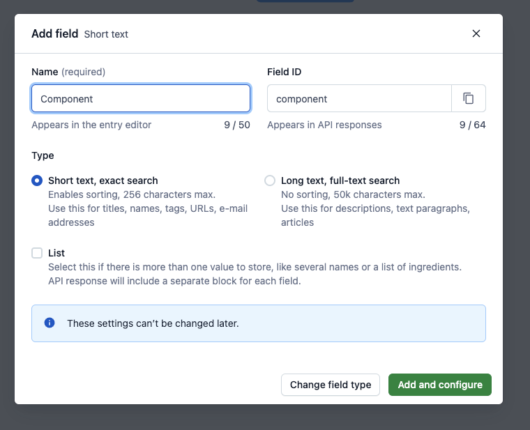
Next, create a Component text field. It is mandatory for all content types which act as components. Confirm by clicking the Add and configure button.
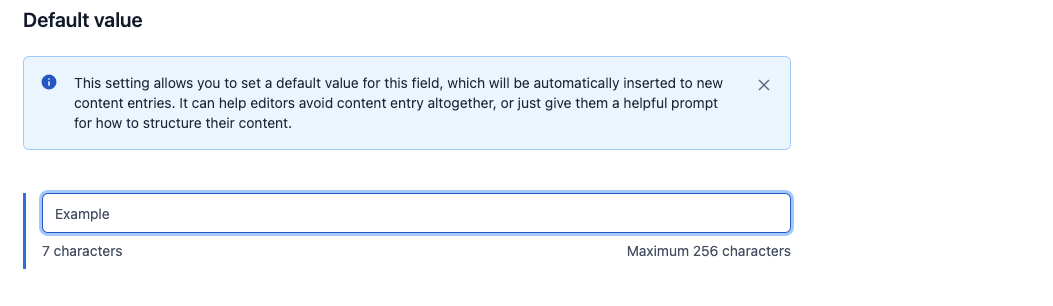
In the next editor, scroll down to the Default value section. Populate the input with the name of the corresponding frontend component - Example. Click Confirm to save your changes.
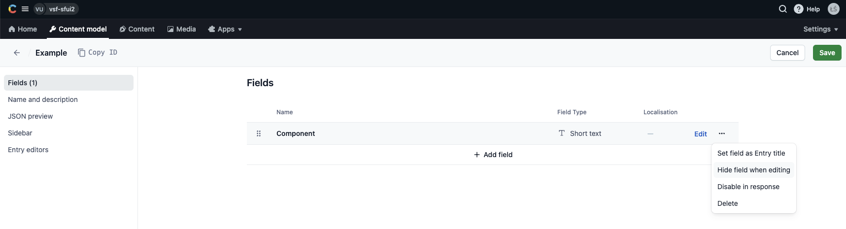
Once the field is saved, you can also hide the field while editing since its value should be the same for all entries of this content type.
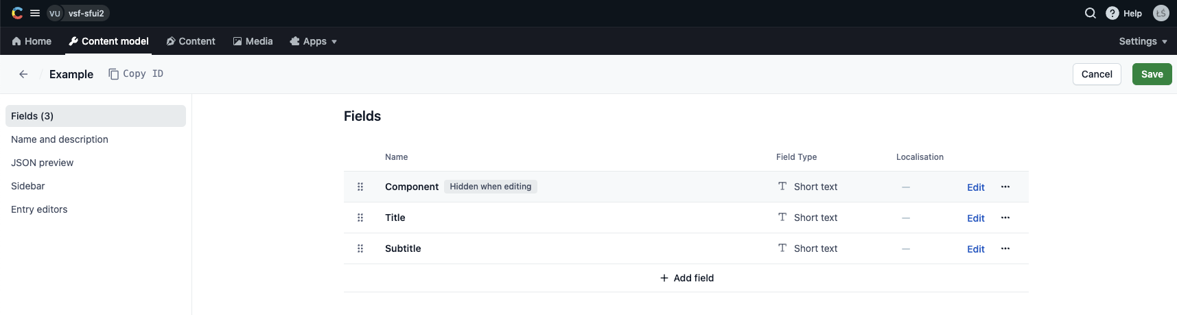
Next, add the fields whose values will be passed as dynamic props to your frontend component. Start with adding two simple text fields: Title and Subtitle. The procedure is exactly the same as with the Component field except you don't set any default value.
Last, create the Button field of type "Reference". Proceed by clicking Add and configure.
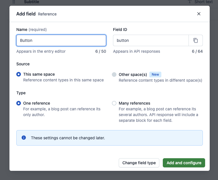
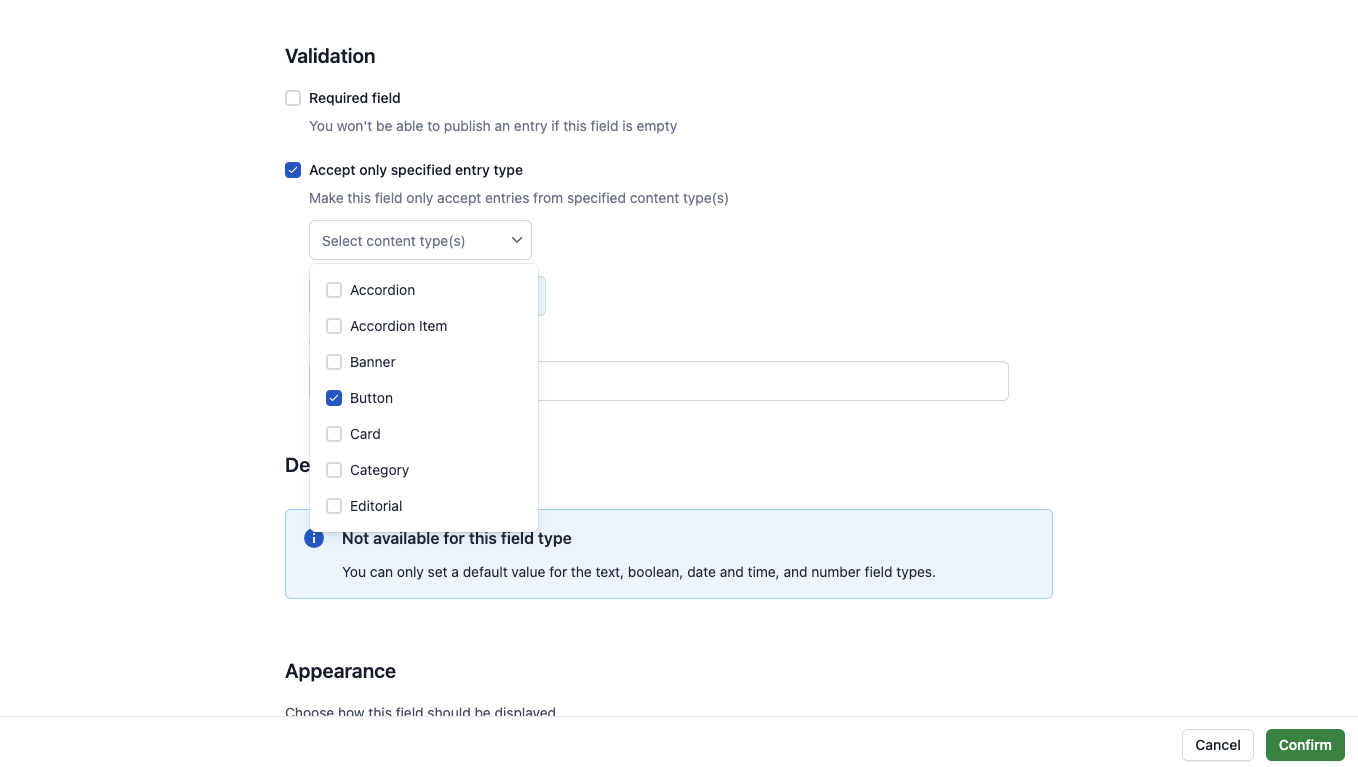
Make the field only accept entries of the Button content type. Proceed by clicking Confirm.
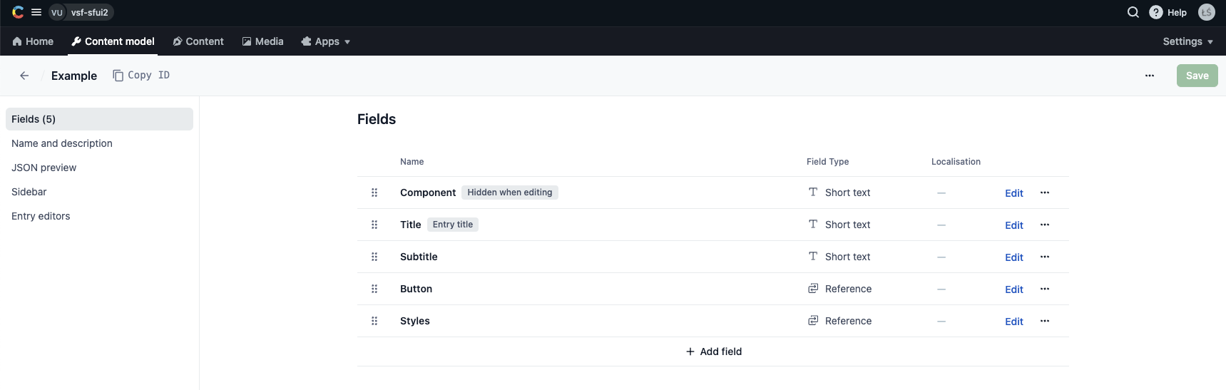
As a bonus, you can make your component stylizable by performing the exact same steps and adding another field of type "Reference" to it. Name it Styles and let it only accept entries of the Styles content type. Once done, save your Example content type schema. Now it should look like this:
Adding the new component in Page
As the final step, you need to make the new content type selectable while creating new Page entries. In the Content model tab, find the container called Page and start editing its schema. Click the Edit button for the Components above the fold field and scroll down to the Validation section. Under Accept only specified entry type, make sure Example is whitelisted.
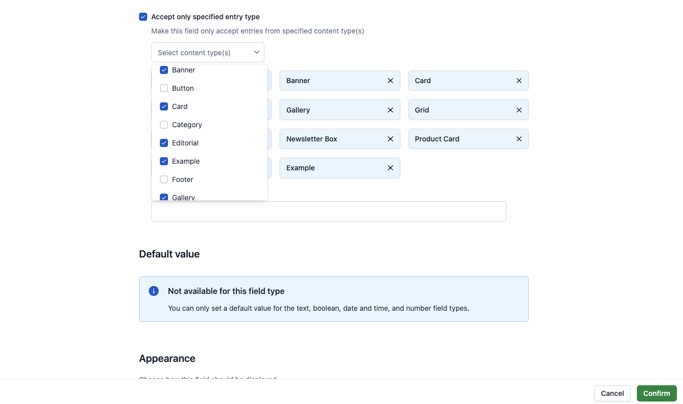
Hit Confirm and do the same for the Components below the fold field. Once done, save the updated schema.
What next?
Your frontend component and the corresponding Contentful content type are ready. Not it's time you added it to some page that can be rendered by your frontend application. Follow the guide on creating pages to see how it's done.